Upgraded autumn coordinates with purple! - "RICCI EVERYDAY's Karaga Pawa Corde" Summary in October-

Hello, this is RICCI EVERYDAY Sasaki Ikuyo.
In November, you will suddenly hear a voice saying "a little more this year", but how are you all doing?
I bought a notebook for next year. The notebook is a wonderful notebook that uses the theme of "plowing yourself", makes it fun just to look at it, and it is also written about fashion.
I'm excited about what year 2022 should be.
This time, I will talk about the coordination introduced in October in the Instagram project "RICCI EVERYDAY's Kala Pawa Corde".
The theme color in October was purple.
Then enjoy it to the end.
1. Coordination for the 1st week
2. Coordination for the second week
3. 3 -week coordination
4. Coordination for the fourth week
Five. summary
1. Coordination for the 1st week

At first, it is coordinated with a purple skirt, a white T -shirt and an easy tote with a scarf.
Purple is an impactful and impressive color, so many people think that incorporating them into their usual coordination is a bit high hurdle.
And the width of the tone is wide, so you may get lost in the color to match. It is still white that suits any tone.
In the coming season, when dark colors are often matched, white is a color that can be used as a highlight effect.
And the ground color is combined with the main easy tote to give an autumn atmosphere.
The earth color, especially the khaki color, is excellent in compatibility with any color, and is addicted to mature coordinates.
It goes very well with the purple of any tone, giving a spicy and cool impression.

Next is here.
The theme "Måneskin"
This coordination was inspired by Måneskin, an Italian rock band, who won the Euro Vision this year and is currently running around the world. Lingering
The slacks pants, which were popular in the 1960s and 70s, were combined with a thick purple sheer blouse to coordinate a hard impression.
The combination of black and dark purple is very cool and gives a calm impression, so it is recommended when you want to decide coolly.
And by putting a devil pattern mini -kero there, it is even more hard.
While the purple part of the devil pattern matches the coordination, the yellow and blue used at the point accent.
2. Coordination for the second week
Next is the second week.

In October, when you gradually feel the weather of autumn and the weather in autumn. There is also a temperature difference in the morning and evening. In such a case, it is recommended to adjust the temperature difference with the 7 -minute top that can withstand the heat during the day and the stall.
This coordination combines a deep purple stall and a white leather skirt.
If the purple with high brightness is a single item, it looks like spring in pastel, but it creates autumn with heavy purple and seasonal leather.
If you use multiple colors and materials that create a sense of season and balance, there are quite a few items that can be used in both spring and autumn, so I hope you can enjoy coordination wisely.
Next, here.

Purple coordination using lines and colors.
A calm purple and brown striped dress and a Kikui Cowhorn bag were combined.
The African plastic pattern of the Kiki Coworn bag uses purple as the point, so it also matches the clothes.
The one -piece stripes and the hexagonal pattern line of the Kiki Kauhorn bag match are not persistent.
If you want to simply decide, put the bag outside the kikui side to simply put together.

Bags using Kikui can enjoy both sides, so the range of coordination expands.
3. 3 week coordination

Black is recommended for combination with pale pastel purple. Pastel purple tends to be a young atmosphere.
If you combine such a pale purple, it will play a role like a coordination spice.
If you combine a pastel -based purple cardigan with a gentle atmosphere with a black dress, it will give you a cute adult, casual and cool atmosphere. Lingering
The feet are also combined with black short boots to create a sporty and cute atmosphere.
The bag is a brown -based purple and green neon color, which is the point of Achero bag 4WAY.
If you hold it as a clutch, it will be an accent of coordination, improving your fashion.

If you change the way you hold it, the impression of the bag will be stronger and the overall atmosphere will change.
The good thing about the Akero series is that you can enjoy various impressions of various impressions even with the same coordination.
Next, here.

October is the Halloween season.
This is a coordination combined with purple and orange, conscious of Halloween.
The point was that the coordination was finished without using "The Purple" and "The Orange" much.
Orange brown cardigan, deep purple, and purple close to blue have canceled the Halloween feeling in a good way, making it a casual Halloween outfit.
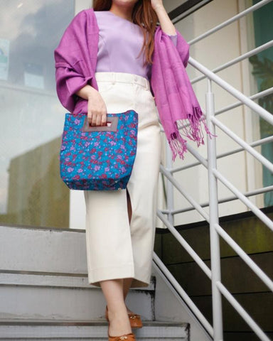
Simple paper beads, colorful bags and clothes are fashionable to have a scarf impact.
Four. 4 week coordination
The last week, the fourth week.

I use a purple shirt with a small flower pattern as a haori.
The inner is a Bordeaux -colored T -shirt.
Purple and Bordeaux are a bit difficult to get used to with single colors, and they are not so compatible, but if they incorporate beige and khaki together, they will be familiar at once.
It is compatible with any color, and it is a color that does not fit in a single color by incorporating earth colors (khaki, terracotta, etc.) that imagine natural goods such as beige, gray, earth, plants, and sea that do not claim too much. He / she does a good job as a connection role.
Before giving up because it doesn't fit, try a little bit and enjoy the color.
Here is the last.

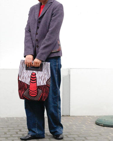
The purple jacket is combined with fussa pink inner and dark denim.
Purple is a "color mixed with red and blue", so it is a color match that is easy to familiar with pink that can be mixed with red.
It is recommended that the purple, which is a little bit like this jacket, is combined with a vivid pink, as it can add a tightening element and give a unique impression.
The dull color is easy to match and I think that it is easy to incorporate, but the skin tone falls off and a calm impression comes out too much.
In such a case, incorporate vivid colors into small items such as inner, bags, scarves, etc., and enjoy the color matching with a little gorgeousness and brightness.
Five. summary
How was it? The theme color in October was purple.
I would be glad if it would be a reference for the worries that purple seems to be difficult to match and it is hard to get, and pastel purple will be too cute.
In the fall and winter, dark tones, especially outerwear, have more dark colors such as black and dark blue.
In such a case, I would like you to enjoy fashion by using African plinting as a point of color and coordination.
African plint is not just for summer! There are various colors and designs, perfect for fall and winter coordination.
Continue to your concerns and questions, and your coordination techniquesInstagramI would be happy if you could receive comments.
Let's enjoy the fashion of autumn and winter by incorporating African plints!


